I liked my website, but there was something not quite right.
I loved the main page, and like I mentioned on the previous website design post, a lot of photographers
have this kind of layout when you first come onto their website. I decided to change
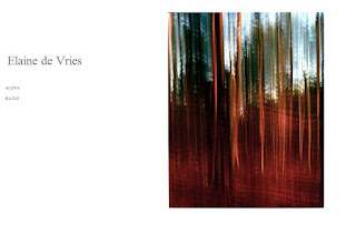
it slightly (right photo is old layout, left photo is new layout)
Hi everyone!
As part of my photography course, I have to track my development on a blog. The posts from September 2011 until January 2012 are part of a module called Project Management, for which I was required to work in a group of eight students to create an exhibition. The blog followed every step we took in order to create a successful gallery. The blog posts starting from September 2012 follow my final year on the course. I'll be documenting my research and analysis of my final year projects, as well as include notes of my Professional Practice unit - which prepares us for a range of post graduate options. Finally it also looks at a project called New Creatives, where I'll be working alongside an artists to help college students get more involved with art.
Showing posts with label Website. Show all posts
Friday, March 1, 2013
Website Design
Friday, February 15, 2013
Business Boom
It's been a little quiet on my blog, but like always I've been doing a lot of work. Firstly, I got my article published on Business Boom a couple days ago!! Here's the link:
It's a great article and I'm very happy with the outcome. It's an amazing opportunity to have an article about me on a website and therefore I've added a "Links" section on my website with a variety of websites that have my work on it. At the moment it's just Business Boom and Sunrise Senior Living (where I took some photos to gain work experience).
Apart from that, I've also completely changed my website. I am so fussy with how it looks and want it to be as professional as possible. It's still a tumblr site, however I've installed a new theme. I feel it looks a lot more professional and more like how a photographer's website should look. to the left is a short little about section and my name. When you click on my name it brings you back to the main screen. I've added 9 pieces of my favourite work. The majority would be landscape photography (I would class the shopping centres as landscapes as they are shot in the same way). And the ducks and Dutch memorabilia also link together. I like how I'm mixing the photos with the videos. When you click on the photo it brings you to a new screen where there is a description and if there are more photos in the series (eg the shopping centres) you can scroll down to see all of them.
On the left hand side I've got a list of clickable links. The first one links to my blog, the second to my Pinterest (which I'm still constantly updating), and the third goes to a second Tumblr website I've set up which solely shows the work I've done while being on the course. Finally there is a contact button, which opens your email program and a links section.
I love the idea of having a separate tumblr for my University work. Although there is quite a bit of overlap now, slowly my University projects won't be part of my portfolio, but will still be on my second website.
I've also been super busy at Subway, which has been taking over all my time. I keep getting called in for 6 hours shifts (even though I'm only meant to be working 6 hours a week!). It's so exhausting, but on top of that I still have to do my research, edit the practical photos, go to lectures, have tutorials, go to crits etc etc etc. And on top of THAT I have to update my blog, flickr, website, pinterest, facebook page, twitter, youtube and I also recently got a Vimeo. The second semester of the third year is definitely the toughest of all.
Monday, December 3, 2012
Website Design
Once again, I redesigned my website. I am really picky with the look of my website and just wasn't happy with it. I didn't want my website to be too full, but I didn't just want to have University work on there either, so I spent ages looking for a theme that I liked. I tried out a couple, but none of them really worked until I found the one.
The top picture to the right is what the website looks like when you open it. There is a 'carousel' of images that I have chosen. It includes a bit of my work outside of uni, but also has a couple projects. The images below is when you scroll down on the page. Again, it's like a blog layout, but I think it works a lot better with the carousel of images at the top. I uploaded nine posts, although with this layout I think I will be able to add more without it looking like too much. I wanted to make sure all my photos are the same size and layout, because then the rows and columns will fit nicely together, rather than it being scattered around. I was even able to upload my video, so I'm really happy I can just integrate that instead of having a separate link.
Finally, When you click on an image it brings you to a new window where there is a little description of each of the projects. In this window you can either decide click back to the main page, of you can use the arrows the go to the information page of the next project.
I'm really happy with the current layout, the only thing I'd like to change is the white border around the images (that I made to create the same size for each image). I'd rather choose a size where you don't have to see that border as it looks quite messy.
Thursday, November 29, 2012
Website Design
Hopefully I'll end up sticking with this for a while longer. I managed to change it so that each image had it's own title and a "read more" link. When you press that link it'll show you what the project is about. Unfortunately I wasn't able to do that for the video, so I left the text there.
I'm obviously very picky with the way my site looks, and although I really liked my Wix site, I didn't like Wix. Once you know how it all works, Tumblr is a lot easier, and it allows me to do whatever I want - and it's viewable on mobile devices.
Tuesday, November 27, 2012
New Website
After the website/portfolio tutorial a couple days ago I decided it's time for a new website. I've been quite frustrated with Wix ever since I've had it. It's quite hard to use and it didn't really let me do what I wanted it to do. The hosting fee was every expensive and there were always wix adverts on the page. You couldn't view the website on a mobile device which is a bit useless since everyone uses their phone/ipads a lot more.
Anyway so I started to think about what other websites I could use to create a website. I first decided to look at Tumblr. I'm not a massive tumblr fan and had never used it before, but I decided to give it a go. It was probably the hardest thing to do. I was so confused and had no idea how it worked. The website still isn't working properly, but it already looks much better than my wix. It's more like a blog format, but I don't want to use it as a blog. I was able to combine text with the images and add videos. I think the website is a lot better already.
I am able to add my domain to the site - I've been trying for about 3 hours. There have been all sorts of problems. First I had to make sure it didn't connect to my wix anymore. I found out I have to change the IP address for the domain so it would link to Tumblr's domain. However I wasn't able to do that myself and had to chat with the domain website for a while to try and get that sorted. After a whole lot of problems it was finally fixed. But then more problems started happening.... In the end I decided to completely delete my wix website and account. I also applied to delete my domain and to use a different website, but I've put that on hold and I want to see whether I will be able to connect my domain with my tumblr now that my wix is out of the way.
Back to the website. At the moment the "message" tab isn't working. No idea how to add information to that page so I'll have to research that. At the moment I've only added 4 of my favourite projects and a bit of text about the projects. Daniel said that my projects were much stronger than my actual portfolio, so I'll leave it like this for a while. I do want to add my favourite travel images,but maybe under a different header (when I figure out how to do all that).
http://elaine721.tumblr.com/
Thursday, November 22, 2012
Website Tutorial
Today I had a group tutorial with Daniel regarding portfolios. I am currently in the process of remaking my physical portfolio so I only showed the group my website. There were a couple points made that I could improve on:
1. The slideshow of images on the first page should go slower
2. 'Travel' and 'Nature' aren't my strongest images
3. Put more emphasis on my 'projects' as they are much more interesting
4. Add text to my projects, so people know what they are about
5. Embed the time lapse video instead of adding a link
6. Remove contact form and just add contact details
Daniel mentioned that he wasn't the biggest fan of my travel and nature images and they are very over done and anyone could do them. I found this a bit offensive and wasn't really happy as Travel photography is the direction I want to go into. After the group tutorial I went up to Daniel and told him I wanted to be a travel photographer and asked how I could change my website in order to still show off the images. He told me that there are two routes I can take with travel photography. Either advertising or national geographic. I've always wanted to be a national geographic photographer, but Daniel and I both concluded that my current work is more in the genre of advertising. In order to further develop the national geographic side I need to give myself projects when abroad. I should approach them in a similar way as my project work at the moment. Travel photography is really just taking photos in a different country. He explained that if an American came to England they could do the project I'm currently working on and call it Travel photography.
Basically, what I'm taking away from this tutorial is that instead of just trying to idealise the countries, I should set a project for myself. One example of this is my shopping centre series (currently on my website under projects). I did this project last year and I looked at Christmas shopping and how busy shops get around Christmas time. The project kind of evolved into looking just at shopping centres at all times of the year. This is a project I've always wanted to continue. I loved the images that I ended up with. If I were to take similar photos at shopping centres all over the world (eg. Dubai, Singapore and Australia) it would be considered travel photography.
All this doesn't mean I'm getting rid of some of my favourite images, it just means I have to try and make a series or a project. There has to be more depth to the images, rather than just taking a pretty picture of a place.
Tuesday, November 20, 2012
Website Design
The second image on the right is my new website. As you can see I rounded it down to two major topics: Travel and Nature. This is the kind of photographer that I want to be. I also massively decreased the number of photos on my website. Each category only has 12 of my favourite photos. It was really difficult to choose my favourites, but in the end I managed to round it down to these 12. The nature section includes both plants and wildlife.
I also added a section called 'projects' which includes some of my more recent work (University projects). The snapshot to the right shows that I've added my Succession project to the site (and a link to my timelapse), as well as my rubber ducks, oldwood field, and shopping centre projects. These four projects were definitely my favourite projects, but they also show off four different styles of photography.
In my 'about' section I added a link to my facebook page, my blog and my flickr. The new website layout is a lot more organised and shows off what I can do without it being too much.
http://elainedevries.com/
Subscribe to:
Posts (Atom)