Hi everyone!

As part of my photography course, I have to track my development on a blog. The posts from September 2011 until January 2012 are part of a module called Project Management, for which I was required to work in a group of eight students to create an exhibition. The blog followed every step we took in order to create a successful gallery. The blog posts starting from September 2012 follow my final year on the course. I'll be documenting my research and analysis of my final year projects, as well as include notes of my Professional Practice unit - which prepares us for a range of post graduate options. Finally it also looks at a project called New Creatives, where I'll be working alongside an artists to help college students get more involved with art.
Showing posts with label Motion Blur. Show all posts

Monday, August 26, 2013

Motion Blur

I am still in love with motion blur photography and did quite a bit of that in The Netherlands. I started taking some photographs at the three country point (3 landen punt) and fell in love with them. I was shooting digital and without a tripod, so the images look very different from my large format photographs.

These three images are just a few of my favourites from the day. They are all completely different and I don't think they would work as a set. The top left photo was taken at about 4 in the afternoon when the sun was still up in the sky. I honestly don't know how it got this beautiful boukeh effect, but I think that's the reason the photograph works. The top right was taken as the sun was setting. It shone through the trees and I shot right at it. It created these intensely bright lines that contrasted with the darkness of the surrounding trees. The colours in other photographs taken in this area were a lot more vibrant, but I liked the fact that the sunlight almost looks like a fire. The bottom left photo was taken away from the sun in a much more densely packed area. I didn't focus on the tops of the trees (emphasising the green), but I looked more at the trunks of the threes and how the sunlight hit that to create different colours. I'm absolutely in love with this photo. I think it's very unique and different from the others.

A few days later, I visited a small village in Germany called Monchau. It was a very nice little place and I took some more motion blur photographs there. The photo I took were completely different to anything I'd done before; they were of buildings. The photo to the right is my favourite, although every one else who I have spoken to prefer the two photos below. The photo to the right is taken of the front of one of the houses. The black panelling creates vey interested shapes and makes the photo look a bit haunting. Although the lines on the building itself aren't completely straight, the line at the edge of the building is dead straight. It almost makes it look like it's framed, or that there are two photographs next to each other. It's a very abrupt end.

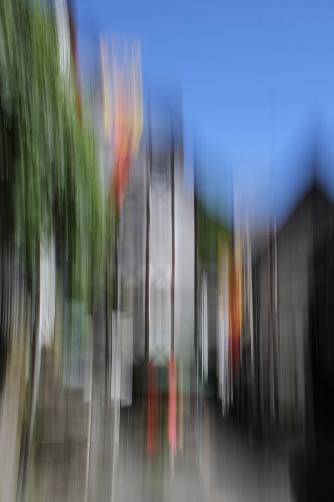
 These two photos are a lot more vibrant. The village had lots of flags everyone, the sky was completely blue and there was a lot of green from the trees. This created a huge contrast with the black and white of the houses. The first of the two photos is a bit more identifiable, than the second, however it's just blurred enough to still be confusing. Because I used a slower shutter speed, there isn't as much movement and it has made the colours a lot more visible. The second photo was a much longer shutter speed and thus the colours look a bit washed out.
 I'm really impressed with these images from Monchau. I never expected motion blur images to work this well of buildings. I guess I was a bit stuck in my tree photos! I'd like to continue this style of photography when I'm in Australia as it's very unique and different. It's a lot of experimentation though, especially without a tripod!!


Monday, April 15, 2013

7591 Miles Finals!!

Today I went to Brighton to pick up my other two final prints for the Eldon exhibition. It feels like the millionth time I've gone to The Vault, but they're lovely and have done a fantastic job with all of my prints. The photo to the right are all three of them. They literally look beautiful. The colours are so bright and having them printed shows so much more detail than when I see them on my screen. The orange and the green in the third photo are so vibrant which relates back to the bold red in the first photo.
 The photo to the left is just a detail shot of the mounting and the paper. It's printed on matt paper and has a seal over it which looks really nice and feels smooth too. I think it's fingerprint proof, but I'm not 100% sure. The diabond mounting is very light and sturdy. I can't wait to put these photos up in the Eldon exhibition alongside my Succession photograph.

This might sound a bit cheesy, but I'm so proud of myself for finishing these two projects. Both of them used large format film, something I never thought I'd ever use, let alone enjoy! I also started playing around in the film-making world by creating time lapse videos, which is something I'm hoping to continue. Both of the final projects are beautifully presented. The Succession photo looks a million times better in its frame, and these three 7591 Miles photos also look a lot more impressive printed and mounted.


Saturday, April 6, 2013

122x54cm Canvas

My boyfriend's dad loved my 7591 Miles photos so much that we wanted to have a canvas made with all three photos on it! He had quite specific sizing for it, so I first created the canvas in photoshop to get all the measurements right. It ended up being 122x54 cm. There is a 5cm border around the photos and 2.5cm between each photo.
I got it printed at The Vault in Brighton, who I have been visiting A LOT recently. They first developed my 5x4 film, I then got my A2 print printed and mounted, I then picked it up, and today I picked up the canvas. I'll have to go again next week to pick up my other two A2 photos in the series..... Luckily I really like Brighton.


The photo above is what it looks like all together. The photo is quite dark so it doesn't show off the colours very well. It's so vibrant!! The red in the first photo really stands out and the green in the third photo looks incredibly. I'm amazed by the quality of the print, as I wasn't sure how it would look. The thick white border around the photo looks great too, it makes the colours pop even more.

Personally, I prefer having each of the photos printed individually, but I think they look fantastic printed like this too. To the left is a little detail shot of the canvas. I love it.

Like I said earlier, I will be going back to Brighton next week at some point (and do a little bit of shopping...) to get my other two photos printed and mounted. I received an email back from my lecturer saying that I will definitely have both Succession and 7591 Miles project presented at the Eldon show. The exact words were "Yes we will make the room", so that is very exciting.

Other than that, it looks like spring has finally arrived in Portsmouth! It's beautiful outside and when you stand in the sun it actually feels like I only need to wear 3 layers instead of 4! In Brighton it's still wintery and gloomy though.

Wednesday, April 3, 2013

Business Cards

I've been going a bit crazy over free samples lately. I've order anything and everything ranging from make-up samples and moisturisers to puppy toys! One of the many many things I ordered are business cards from Moo.com. Moo is an online company that specialises in professional looking business cards for reasonableness prices. I desperately need some new business cards as I ordered mine from Vista Print for very cheap and they aren't very good quality (Card Paper). I've also got an image on it that isn't even in my portfolio anymore!

Anyway, so then I came across Moo's free business card samples. You could order 10 cards for free with free postage and everything. This is where the crazy part comes in... I got them sent to 4 different addresses so I managed to get 40. I sent one pair to my flat in Portsmouth, one to my parent's house and one to both of my boyfriend's parents' house.

3 out of 4 are now at my flat in Portsmouth and I will be collecting the last set sometime in the near-ish future. First I ordered some "Pet Photography" business cards, since I'm very interested in that field at the moment. They look beautiful. The quality of them is amazing, they are very thick and smooth business cards and have got a matt finish to them. The second set I ordered is of my 7591 Miles project. It's simply got on photo on the back. The third set I ordered was my Succession photo. I originally wanted to have the circle on the back, but I have having all sorts of problems, so I just put it tiny on the front to get the idea, and then the clearing photo on the back. I quite like it this way because I love the clearing photo, and it shows the quality of the photograph. Finally, I printed my ducks. At this point, I figured out that you can choose multiple designs for the cards, so I chose 4 different photos (3 blue, 3 purple, 2 red and 2 yellow).

When I order my real business cards (I won't just live off of free samples...) I reckon I'll create several different designs to show the range of photography I can do. I'll probably order 100 cards and choose maybe 5 different projects? I haven't quite decided yet, I wanted to have a look at the quality first.

I don't expect to get rid of all of my business cards during the Eldon show, so I will be using them in Australia too, although I'll just have to cross out my mobile number and write a new one. Or maybe.... order another few free samples to various different addresses. Neighbours??


Monday, April 1, 2013

March

It's time for my monthly video! It's something I've been doing since January, and basically every month I take a whole load of photos/videos/time lapses and I put them together in one video at the end of the month.
January: http://www.youtube.com/watch?v=krNZrlufyUA
Feburary: http://www.youtube.com/watch?v=q6BtKr06yTs
March: http://www.youtube.com/watch?v=1i15xhVqT6U

March has been pretty busy! It started off with me going to the Artful Dodgers in London, and also visiting the BEST burrito place in the world (at the westfield in stratford). It basically works like subway, but then it's a wrap and it's filled with all sorts of tasty things. I love it. So I took a photo of it to show everyone how incredibly full it is! I then photographed a tribute band called The Bootleg Beatles, who dressed up like the Beatles and sang their songs. I accompanied Lauren Whatling as it's one of her projects and it was great fun! I do have a few blog posts about the experience, but I really enjoyed that. At the end we also received their autographs which was very exciting.

That was then followed by New Creatives! New Creatives is a project I've been working on since October 2012 where I worked alongside an artist, Oliver Merkin, and we went to Portsmouth and Havant College to help students with their art work. It was then displayed at Aspex Gallery in Gunwharf. I first took a time lapse video of the curation of the show, which was then displayed at the exhibition, and that's followed by some photographs of the preview night taken by Lauren Whatling.

The video then continues to show some of the work Kevin and I have been doing, so it includes my dissertation, which I handed it at the start of this month and Kevin's dissertation poster which he got a fabulous 2.1!

I then went to my parent's house for a couple days and photographed my parents' beagle multiple times. She's a great model, but also very naughty. I've got a photograph of her holding some stolen chopsticks. Of course, I couldn't leave out my little hamster, Chili! Who is also a massive poser.

In between my Kayleigh shots and Chili shots there is a photo of my with a giant suitcase. I bought myself a huge huge huge light weight suitcase for £40, which was quite a good deal as it was meant to be double that. It's literally gigantic. Which is good, because I've also done a whole load of shopping to fill it up with.

I then went to the circus in Portsmouth. I received some free tickets from Subway since we let them advertise. It was a great show! I took a whole load of photos but also some timelapses! It was surprisingly difficult since I had to use a really slow shutter speed, but the time lapses have turned out quite nice actually!

Finally, I also got a whole load of stuff done for uni. My Succession photo has been framed and is hanging up in my parent's house. It looks amazing!! It looks so much more professional and expensive now it's framed (which it should do....). I also got my 7591 Miles photo printed and mounted on diabond. I love it. It looks fantastic. However, my lecturers like it too, which could be seen as a positive, but they want my to print the other two photos in the series exactly the same..... That's pretty pricey.

Anyway then the video finishes with some more shots of Chili, who really did not want to be photographed and tried to escape.

Saturday, March 23, 2013

Framing/Presenting

After a bit of a stressy start of the day, thanks to the snow, I managed to pick up all my finals! First we went to the framing shop in Woking where I got my Succession photo framed. As mentioned in a previous post, I wanted to have a white frame, not too thick of overpowering, and a circular mount so it wouldn't be too layered. I wasn't too sure about the circular mount, but it looks amazing! In fact, it doesn't actually look like it has a mount, which is good, because nothing distracts you from the photo itself.


The top right and the middle left photo are both of the succession photo. You can't see the photo itself very well because of all the lights. I'm so so so happy with the white frame, I think if it was a black frame the photo would have looked a lot smaller and enclosed and the frame would be a main focus point. The glass looks beautiful as well. It makes the photo look very expensive (which it is...) and the glossiness of it makes the photo look more 3 dimensional.

The photo to the left is just a close up of the mount and the frame. It looks beautiful. Unfortunately I could only see the photo for a few minutes before it got wrapped up and put in the back of the car.


We then drove to Brighton to pick up my A2 photo for my motion blur project. I should really start to refer to it as 7591 Miles as it sounds so much more professional. Anyway, this also looks fantastic!! I printed it on matt paper so it wouldn't look like one giant mirror and it's mounted on diabond. The mounting is literally gorgeous. I'm so happy with it!! Diabond is basically the same as aluminium mounting, but a lot lighter in weight.

I can't really find the right words to describe it all, because both of these projects are the most professionally presented work I've every created. My Succession photo will be up in the Eldon exhibition in May/June, 7591 Miles will be handed in as my final for this project.

Friday, March 15, 2013

Title


Thinking of a title is probably the hardest part of the whole project. I don’t want anything cheesy or obvious, but I don’t want something that sounds silly or too abstract. When seeing the title, I want people to start to understand the work, but not completely give it away.
I’ve been thinking about a title for a long time, but it wasn’t until the group tutorial recently that we got the ball rolling. Some things that were suggested were “moving on” or “immigration” or simply “movement”. It seemed to simple and rather obvious. I don’t want the title to ruin the whole piece!
Then Dan (a course mate) thought of the idea of adding up all the miles I’ve travelled together and have that be the title. I thought it was a fantastic idea!! It shows the distance I’ve travelled, without using obvious words.

I started to think about whether to include every single move, or just the out of country moves.
Moves:
1.      Within The Netherlands
2.      From Netherlands to America
3.      From America to Netherlands
4.      From Netherlands to UK
5.      Within the UK
6.      Within the UK
I don’t think the moves within the same country are as important as that happens a lot more. The 3 photos also indicate the three countries where I have lived, thus it would be more appropriate to only add the distances of the moves abroad, to The Netherlands to America, America to The Netherlands and The Netherlands to England.
I used the following website to find out the distance as google maps wouldn’t work as it was an overseas action.


I could only get approximate locations so that’s what I did first:
Rotterdam, The Netherlands – Newark, New Jersey: 3639.962 Miles
Newark, New Jersey – Rotterdam, The Netherlands: 3629.962 Miles
Rotterdam, The Netherlands – London, UK: 198.990 Miles
= 7478.914
I wanted to be more specific so I used Google Maps to determine the exact miles between where I actually lived and the approximate location:
Nieuwerkerk a/d IJssel – Rotterdam: 11.3 Miles
Newark – Upper Saddle River: 28.3 Miles
London – Gerrards Cross: 22.0 Miles
So all together the distance would be:
First Move: 11.3+3639.962+28.3 = 3679.562
Second Move: 28.3+3639.962+11.3 = 3679.562
Third Move: 11.3+198.990+22.0 = 232.29

Altogether:
7591 Miles

Printing and Mounting


Hi Elaine

As explained re telephone conversation. The original print supplied was made as a result of scanning the negative and outputting the image via a digital machine onto photographic paper.
As we were instructed to produce a hand print we were unable to match the supplied print as the colours and contrast on this type of digital print are greatly enhanced by the machine used.

I will return a test strip with your negative and sample print to show you the problems we encountered.

Bryan O'Leary


Unfortunately I couldn't get my image handprinted at the Artful Dodgers as somehow the negative was scanned wrong and the colours were changed. These are two photos to show the difference between the negative and the scan. I am not sure how this massive difference happened, as I scanned them in properly (choosing the right film, not editing etc). The difference between the images is that the scan has come out very red – something I love about the photo – whereas the hand print has more realistic colours to it – a browny grey.

After having seen the hand print, I have decided to stick with how I scanned in the photo. Although the colours in the hand print are more realistic to what I took a photo of, the redness of the photo is partially why I love it. I think it also better to stick with the scan as it fits in the with the sequence of the three photos and finally I feel it better portrays my concept. It’s about confusion and beauty. The colours from the hand print make it very obvious as to what you’re looking at. The redness makes it more abstract and confusing, but also more beautiful and special.

This is why I have decided to stick with the scanned image rather than the hand print. I do not want to sacrifice the outcome of my photo if the only reason is for it to be hand printed. 

I went to The Vault in Brighton today to get my scanned images printed. As explained earlier, I wanted to stick to my scanned image rather than getting it hand printed. I decided to get it printed A2, mainly as that’s all I can afford at the moment. It will come to £32, although the mounting will be another £45. I’m very excited to see the outcome of it. I was shown a different photo mounted on Diabond and it looks fantastic and incredibly professional.
I am only getting the red motion blur image printed A2 and mounted, and the other two photos in the series will be A3. Luckily I only need to have one image professionally presented and mounted, and the other two can be a smaller size (although still professionally done but not mounted). 

Sunday, March 10, 2013

52 Week Photo Challenge

When I found out the theme for this week I was incredibly excited - it's Painted. My project for this semester is all about photograph looking like paintings, so I decided to do another motion blur photoshoot to get that effect. The photo to the right is my favourite from the shoot. It's quite different from the photographs I've taken for my project as the main focus were the straight lines, whereas this photo has "loops". I felt this looked more like brush strokes and thus made it look more painterly.

For this shoot I didn't use a tripod. I remember from my first few motion blur shoots I didn't use a tripod and the images weren't as geometrically created. The image to the right looks a bit more "free" meaning the lines aren't completely vertical. 

I love the abstraction of the photograph, without knowing what it is, it would literally be unidentifiable. My large format images do show a bit of forest detail, however in this photo everything is incredibly blurred. The photo is taken in a portrait style to steer away from the traditional landscape photography. Because it's still winter and it was a cloudy day, the colours don't indicate it's a woodland either. 

Saturday, March 2, 2013

Motion Blur Time Lapse Analysis


The reason I decided to put these scenes together is because of the matching colours throughout the whole video. The video starts off with quite a light scene, with a pastel blue, light brown, a bit of green, and a pastel yellow. There is a dark line straight through the middle of the photos. To me, this scene almost looks like fire. It is one of the most abstract scenes in the video. The reason I decided to start off with this scene is firstly because it’s from my first motion blur time lapse, so it’s keeping it in order, but also because it’s completely unrecognisable. I want people to guess what they’re looking at rather than knowing it straight away.

The second scene is quite a bit darker, but still very obscure. The colours match with the darker colours from the initial scene. The lines are completely straight, which relates back to the tree trunk in the middle of the photo of the first scene. At some points you can see a bit more detail towards the tops of the trees, but it’s so quick that doesn’t defeat the abstraction.

The third scene is probably the most obvious scene. I’m standing a bit further away from the trees, so the landscape is more apparent. The tree on the left of the scene closest to the camera has the most detail. The reason I added this scene is so it starts to indicate what you’re looking at. Each photo is taken in such a similar way, that it almost looks as though I’m taking a photo of a blurred scene, instead of blurring the scene myself. What interests me about this scene is the fact that you can see the tops of the trees moving in the wind – something that you would normally take a time lapse of.

The colours in the fourth scene are similar to the ones in the first scene. It’s got a very pastely green in it, and a bit of light blue towards the top. In this scene there wasn’t any natural movement so I stood close by a road. It was getting a bit darker at the time so cars started to use their lights. This created interesting shapes within the time lapse and would make the viewer think about what they’re looking at. Again, in every scene so far, the trees have been completely vertical.

The fifth scene is a very interesting scene. This was taken on a different day than all the previous scenes so far. It was a very sunny day with cloudy intervals. This meant I could emphasize the natural changes in the landscape within my time lapse. This scene shows the sun moving through the clouds creating shadows, but also intricate shapes on the trees. The colours are a lot more bold when it’s sunny, but in the shade they are similar to the colours in the third scene. The blue at the top of the photos relate back to the first and fourth scene. This scene is a sort of transition between the start of the time lapse and the end of the time lapse. The first half is all taken on cloudy days, whereas the second half is taken on sunny days. Because this scene includes sun and shade, it was the perfect way to transition.
The sixth scene reminds me a lot of the first scene. The colours are very similar and composition of it is quite similar. The green bushes towards the bottom of the shot keep getting hit with sunlight and then darkening again when the sun disappears. It’s not as obvious as the previous shot, but creates subtle changes.

The final scene is looking up. One of my original digital photos was looking at the tops of the trees and it was one of my most popular photos, therefore I decided to create a time lapse of that image. The colours are similar to the previous scene, the first scene and the fourth scene. It’s very light, but still has some darkness to it. I like the fact that in some of the photos the tops of the trees are very obvious, whereas other photos are completely blurred. This creates confusion.

I decided to add Hans Zimmer’s “Time” song to it as it relates to my concept. The photos are about movement and the juxtaposition between beauty and confusion. But the music adds the sense of time to it. The images reflect on a journey, it’s me looking back at my experience of having lived in all these countries. 

Motion Blur Time Lapse

http://www.youtube.com/watch?v=e1yL3208sko

Friday, March 1, 2013

Motion Blur Time Lapse


As picky as I am, I decided to go back and work on my time lapse again. I thought I was finished with it, but there was something bothering me. The final time lapse sequence of the sky wasn't exactly what I wanted to do, and as I was flipping through my workbook, I noticed I'd taken another motion blur time lapse of the sky which was MUCH better, but I didn't have enough images. Now that I know a bit more about motion blur time lapses and how to edit them, I thought I would give it a go. It's currently in the process of being created, so I don't have a link yet, but when I do let you know! The right image is how the time lapse originally was, and the left photo is what I've changed it to. It's not as abstract, but it looks a lot better, and the faint colour matches the rest of the scenes.

February 2013

Last month I created a video of all the things my boyfriend and I have been up to in January. This started out because of the idea we're moving to Australia in September and want to do as many things as we can while we're in England. Although we haven't done as much as last month, I created another short video about February!
http://youtu.be/q6BtKr06yTs
I really like creating these videos as it's a great way to remember this year. It'll be a pretty crazy one: England, The Netherlands, France, Belgium, Germany, Dubai, Singapore, Australia..... By the end of this year we'll have an amazing video filled with memories.

Artful Dodgers

Today I went up to London to go to the Artful Dodgers. It was at Chancery Lane and definitely not what I was expecting... I had to get buzzed into the building and walk down to the basement, getting a bit lost in the basement! Anyway, you enter Artful Dodgers and it's just one room filled with prints everywhere! It was great to see the other people's work and the scale of everything! I will be getting the photo to the left printed A2 sized (20x24 inches) on matt paper. They will post it to me in a huge tube on Monday the 11th and include all the test prints. I've very excited to see how it's going to turn out!!

The reason I went to Artful Dodgers is because they specialise in hand printed images from the dark room. According to my lecturers they will look a lot better and will have a lot more depth and detail to them. Having them hand printed will also mean that I'm not making use of any digital technology, they are taken in an analogue style and will also be printed that way.

When I get my photo back from the Artful Dodgers, I will go back to The Vault in Brighton to get it mounted on Diabond (similar to aluminium). When I got my negatives developed there, I had a chat with one of the guys there about mounting options and he showed me what diabond is and how it would look. I thought it looked fantastic, so I'll be getting that done for my final. Hopefully I can get it all done in time for the "Crit" - our little Eldon exhibition for everyone on the course - but with my shifts at Subway, New Creatives commitments, my dissertation hand in and all my lectures, that might be a bit unrealistic. Luckily our final deadline is after the Easter holiday.

On Wednesday 6th I'll be helping up at Aspex gallery to set up the show and hang up the work. I'll be creating a time lapse video of this which I will exhibit in Aspex gallery.

Sunday, February 24, 2013

Concept


After doing a whole load of research on abstraction and why people use abstract art, I noticed that everyone used the idea of abstraction to express themselves, or show emotions. Vladinsky thought that colours evoked specific emotions, Pollock’s work looked at wild physical action and have come to represent the revolutionary mood of the time, Willem de Kooning’s work centered around aggressive applications of paint that created emotionally intense imagery, Mark Rothko and Barnett Newman used the expressive potential of colour within their work, Jitka Hanslova used the forest where she grew up as the foundation to her work and finally Charles March took photographs of the trees around him, as they have always played an important part in his life. He used abstraction to add a sense of emotion to the work.
After all this, I started to think about what the photos evoke in me. They are about movement and the juxtaposition between beauty and confusion. What immediately occurred to me is my moving experience. I have lived in three different countries, and although this has been a fantastic experience, it’s also been incredibly hard. These images accurately portray my feelings towards my past.

0-7 – The Netherlands
7-9 – New house in The Netherlands
9-12 – America
12-14 – The Netherlands
14-18 – Buckinghamshire, UK
18-20 – Both Surrey (parents) and Hampshire (Uni)

Obviously this shows movement. Although it has been tough, I absolutely love the fact that I’ve lived in all these places. 
 

Wednesday, February 6, 2013

Time Lapse 3

It's been a little quite on the blog, but I've still been busy! I put together my third (and hopefully final) timelapse on Monday. It was a really nice and sunny day although there were cloudy intervals and it was really windy. This worked perfectly with the time lapse, as normal time lapses are usually about the movement of the landscape, eg the tops of the trees moving in the wind or the sunlight moving over time. In the motion blur timelapses, obviously I'm already moving the camera, but since I got the technique down, it was really interesting to see how each of the photos are almost identical, yet the sunlight moves through the frame (it'll make more sense when you view the video) or the tops of the trees create movement.

I pieced together my favourite scenes from each time lapse and made a final piece. The scenes from the second time lapse were all taken on cloudy days, so I couldn't just have half the video in the shadow and half in the sun without some kind of transition. The scene I was talking about earlier, with the sunny intervals is the link between the sun and the shade. I'm really happy with the outcome of my time lapse and hope the lecturers will like it just as much!

http://www.youtube.com/watch?v=naKX4y7kB7M

Sunday, February 3, 2013

Motion Blur Timelapse 2

I wasn't too happy with my first time lapse and I wasn't really sure whether I wanted to do another one. However, Daniel seemed quite impressed with it, and since I do love making time lapses, I thought I'd give it another go. I knew what I did wrong in the first one, so I know what I had to change. I went out again today, but it was a completely different day. It was dark and cloudy and completely motionless. I thought this would be the perfect day for the time lapse, as the darkness would allow me to take longer exposures. But.. it turned out it was just as boring on the time lapse as it was in real life. I did manage to make it a bit more interested by getting the lights from cars in the time lapse. It created some interesting shapes.

After viewing it on the laptop I was thoroughly impressed with myself. Instead of a time lapse that literally looks like I'm shaking my camera about, it's more like I'm taking a video of something that actually looks like that. Each of the photos look almost identical, so the movement in the photos is just the tops of the trees moving (other than a little bit of up and down movement). 

Something that stood out to me during the shoot was the fact that one still image looked completely abstract and unidentifiable, but when the series of photos played as a movie, it was quite obvious what you were looking at. The photo to the right is an example of it. The photo is taken of a really dirty pond. The bottom of the photo is the reflection of the tops of the trees, the green colour is the dirtiness of the pond, the browny-red colour is the muddy ground and the dark lines are the tree trunks. It's not the most obscure photo, but if you didn't have any of the information it could be pretty confusing. Anyway I created a time lapse, and when I played all the photos it just completely contextualised the photo. Some photos aren't as blurred as this one, so when I played the movie it almost seemed like it was picking out all the recognisable bits. The ground is probably the most recognisable in this shot, so if the next shot had the trees in focus, followed by the water in focus, you see the whole shot!

This is the link to the edited version of the video. I used one scene from my previous time lapse as I loved it! But the rest is all taken today. The shot above isn't part of the time lapse:

Saturday, February 2, 2013

Comparison


I'm happy with the middle and the right image but am unsure which one to use for the first one. Both images are quite similar in colours so they both fit nicely with the other two images. The top photo is a bit more obvious, whereas the bottom one is completely obscure and unrecognisable. In the top photo, the trees go to the bottom of each of the photos, however in the second sequence the bottom of the photo is very dark and doesn't have as much detail.

If I go for the first sequence of photos, the first and third are quite obvious as to what the photo could be of, however in the second sequence, only the third photo is obvious. I think the next step is to get the photos printed and see what they look like in real life, rather than a screen!

Friday, February 1, 2013

Large Format Scans

Yesterday afternoon I spent an hour scanning my large format images and I'm so happy with how they came out! The colours look beautiful and very different in each of the photos. The photo above shows three of my favourite images. The first one is the most obvious as you can identify the most features, however the colours are so bright that it returns to the abstraction. The middle photo has completely different colours and is probably my favourite out of the three. There is no indication of what the photo could be of. The third photo has the colours an ordinary landscape photo would have, but is blurred in such a way that it's the most like a painting. The three of them look so different from one another, and that's why they work as a set.

Tuesday, January 29, 2013

Updates

This week has been pretty crazy. Lots of hours at Subway, the studio, large format shoot, time lapse shoot, research, practical work, trying to find a place to get my work developed, more hours at Subway, lots of train journeys, tutorials etc etc etc. I'm exhausted.

First of all, I created a motion blur time lapse, which seemed impossible at first, then ended up being really easy, but then actually turned out was pretty hard. I'm not completely happy with it, and will definitely need some editing, but here is a link: http://www.youtube.com/watch?v=FhCfJ67C84k. Next time I'm in the Woking area, I'll try this again, but get a more sturdy tripod. The reason the time lapse is a bit all over the place is because while moving my camera up and down, the whole tripod started bouncing up and down too. A sturdier tripod will mean straighter lines, which is what I want to go for.

Secondly, I had my large format shoot, which I already wrote about. The shoot itself was great and I do still love large format, however it's all the stuff you have to do afterwards that's frustrating. Such as the developing and scanning. It wouldn't be too bad, if the university colour processor was working, but unfortunately that's been broken for about 2 months and is currently in Germany.. After a lot of searching/panicking I messaged Fergus Heron to ask where he gets his film processed. He told me about this little place in Brighton where they process the film for £2.50. I phoned them up to see how long it takes to process and they told me 2 hours. The plan was to go to Brighton at 9.33 (be there at 10.45) get to "The Vault" (15 min walk) and get it processed (2 hours - 11.00-13.00), but somehow be back in portsmouth at 14.30 so I could go to work..... I asked whether they could have it finished any quicker and they could! They did it for me in an hour and 15 minutes which left me plenty of time to catch my 13.00 train to be back at 14.15. Phew.

I've also booked the scanner for Thursday afternoon so I can really see how all my images have turned out, but right now this'll have to do!

Finally, I got my marks back for my first semester project (the succession circle) and it's a first!!! Very exciting and an excellent start to the third year. Hopefully all my marks will be this good and I'll pass with flying colours! I also had my dissertation feedback tutorial which was great as well. My tutor explained to me that my content was fine and it's well written, the only criticism is that some bits are too descriptive and others need more analysis. Other than that it's just little bits and pieces that can easily get fixed. She said if the dissertation was marked, it would probably be around a 2:1! My hard work is definitely paying off..