Hi everyone!

As part of my photography course, I have to track my development on a blog. The posts from September 2011 until January 2012 are part of a module called Project Management, for which I was required to work in a group of eight students to create an exhibition. The blog followed every step we took in order to create a successful gallery. The blog posts starting from September 2012 follow my final year on the course. I'll be documenting my research and analysis of my final year projects, as well as include notes of my Professional Practice unit - which prepares us for a range of post graduate options. Finally it also looks at a project called New Creatives, where I'll be working alongside an artists to help college students get more involved with art.
Showing posts with label The Netherlands. Show all posts

Monday, August 26, 2013

Motion Blur

I am still in love with motion blur photography and did quite a bit of that in The Netherlands. I started taking some photographs at the three country point (3 landen punt) and fell in love with them. I was shooting digital and without a tripod, so the images look very different from my large format photographs.

These three images are just a few of my favourites from the day. They are all completely different and I don't think they would work as a set. The top left photo was taken at about 4 in the afternoon when the sun was still up in the sky. I honestly don't know how it got this beautiful boukeh effect, but I think that's the reason the photograph works. The top right was taken as the sun was setting. It shone through the trees and I shot right at it. It created these intensely bright lines that contrasted with the darkness of the surrounding trees. The colours in other photographs taken in this area were a lot more vibrant, but I liked the fact that the sunlight almost looks like a fire. The bottom left photo was taken away from the sun in a much more densely packed area. I didn't focus on the tops of the trees (emphasising the green), but I looked more at the trunks of the threes and how the sunlight hit that to create different colours. I'm absolutely in love with this photo. I think it's very unique and different from the others.

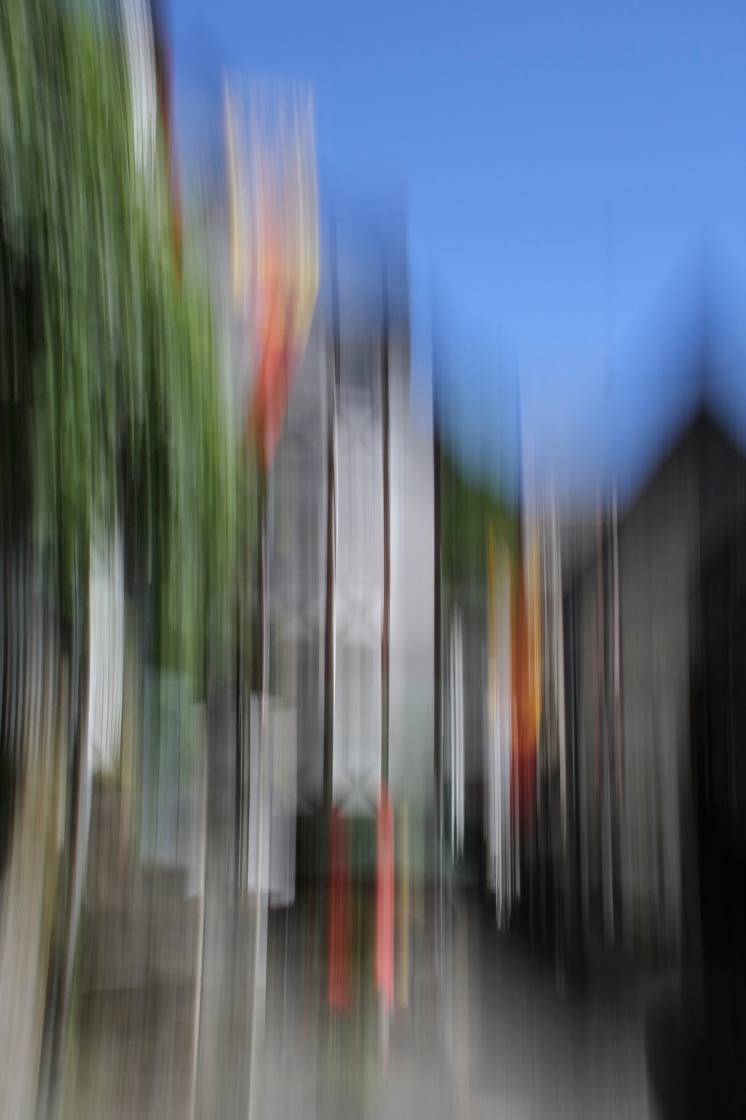
A few days later, I visited a small village in Germany called Monchau. It was a very nice little place and I took some more motion blur photographs there. The photo I took were completely different to anything I'd done before; they were of buildings. The photo to the right is my favourite, although every one else who I have spoken to prefer the two photos below. The photo to the right is taken of the front of one of the houses. The black panelling creates vey interested shapes and makes the photo look a bit haunting. Although the lines on the building itself aren't completely straight, the line at the edge of the building is dead straight. It almost makes it look like it's framed, or that there are two photographs next to each other. It's a very abrupt end.

 These two photos are a lot more vibrant. The village had lots of flags everyone, the sky was completely blue and there was a lot of green from the trees. This created a huge contrast with the black and white of the houses. The first of the two photos is a bit more identifiable, than the second, however it's just blurred enough to still be confusing. Because I used a slower shutter speed, there isn't as much movement and it has made the colours a lot more visible. The second photo was a much longer shutter speed and thus the colours look a bit washed out.
 I'm really impressed with these images from Monchau. I never expected motion blur images to work this well of buildings. I guess I was a bit stuck in my tree photos! I'd like to continue this style of photography when I'm in Australia as it's very unique and different. It's a lot of experimentation though, especially without a tripod!!


Sunday, February 24, 2013

Concept


After doing a whole load of research on abstraction and why people use abstract art, I noticed that everyone used the idea of abstraction to express themselves, or show emotions. Vladinsky thought that colours evoked specific emotions, Pollock’s work looked at wild physical action and have come to represent the revolutionary mood of the time, Willem de Kooning’s work centered around aggressive applications of paint that created emotionally intense imagery, Mark Rothko and Barnett Newman used the expressive potential of colour within their work, Jitka Hanslova used the forest where she grew up as the foundation to her work and finally Charles March took photographs of the trees around him, as they have always played an important part in his life. He used abstraction to add a sense of emotion to the work.
After all this, I started to think about what the photos evoke in me. They are about movement and the juxtaposition between beauty and confusion. What immediately occurred to me is my moving experience. I have lived in three different countries, and although this has been a fantastic experience, it’s also been incredibly hard. These images accurately portray my feelings towards my past.

0-7 – The Netherlands
7-9 – New house in The Netherlands
9-12 – America
12-14 – The Netherlands
14-18 – Buckinghamshire, UK
18-20 – Both Surrey (parents) and Hampshire (Uni)

Obviously this shows movement. Although it has been tough, I absolutely love the fact that I’ve lived in all these places. 
 

Wednesday, February 6, 2013

52 Week Photo Challenge


For this week the theme is "Foreign". I'm foreign so it was pretty easy. I didn't want to take a picture of myself as that would be a bit silly, but throughout a lot of my photography, especially the work on my website, I've a explored the idea of my past and the different countries I've lived. I didn't want to make it anything depressing as I love the fact I've moved around so much. My initial idea was my ducks. They've been getting so much attention lately so I thought I'd do something similar. For Christmas I received a duck with the Dutch flag, and I already had one with the English flag and the American flag so I photographed each of them against a white background indicating the three different countries I've lived (so far). 


I really like the look of them, and think they will make an excellent addition to my portfolio! 

Friday, February 1, 2013

Business Boom

"Business Boom Collective is the ideal place to see features of up-and-coming and freelance creatives from the UK and beyond. In collaboration with a collection of modern and slick websites including Business Boom Bolton, The Mancunianist as well as our latest store feature, I Think I Need I Want, it is the perfect place to read up on the brightest individuals and most current businesses linked to the worlds of fashion, photography, art, design and more."

Everyone kept telling me how great Twitter was and such, but now I've experienced it first hand. One of my friends on the course retweeted a status by Business Boom and having your work featured on their website. As an up and coming photographer who's trying to make it out, of course I'd want my work featured! I immediately sent them an email with my website and within a couple of hours they replied that they really liked my Rubber Duck series and they'd "love to put something together for you". They asked me to write a bit about myself, my education, inspirations, aspirations etc. I've just written a short piece including a bit about my rubber duck series, my The Netherlands photos and of course my Succession project. I can't wait to see what it all looks like!!