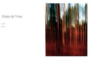
I liked my website, but there was something not quite right.
I loved the main page, and like I mentioned on the previous website design post, a lot of photographers
have this kind of layout when you first come onto their website. I decided to change
it slightly (right photo is old layout, left photo is new layout)
 I think it looks a bit more organised as it’s all centred.
The layout from the previous layout was a bit scattered. My name was slightly indented,
but the “work” and “blog” text wasn’t. It looked a bit out of place. This layout
isn’t like that. My name is just about the same length as the photo, and the three
links are centred perfectly. I decided to add a “contact” button to the front page
because it’s important that people can easily contact me if they need me.
No comments:
Post a Comment