I wasn't happy with the website. The reason I changed it to the previous post is because I wanted to add text. However, looking at the result I felt there was too much text on the main page. I decided to change it again....
Hopefully I'll end up sticking with this for a while longer. I managed to change it so that each image had it's own title and a "read more" link. When you press that link it'll show you what the project is about. Unfortunately I wasn't able to do that for the video, so I left the text there.
I'm obviously very picky with the way my site looks, and although I really liked my Wix site, I didn't like Wix. Once you know how it all works, Tumblr is a lot easier, and it allows me to do whatever I want - and it's viewable on mobile devices.
Hi everyone!
As part of my photography course, I have to track my development on a blog. The posts from September 2011 until January 2012 are part of a module called Project Management, for which I was required to work in a group of eight students to create an exhibition. The blog followed every step we took in order to create a successful gallery. The blog posts starting from September 2012 follow my final year on the course. I'll be documenting my research and analysis of my final year projects, as well as include notes of my Professional Practice unit - which prepares us for a range of post graduate options. Finally it also looks at a project called New Creatives, where I'll be working alongside an artists to help college students get more involved with art.
Thursday, November 29, 2012
Tuesday, November 27, 2012
New Website
After the website/portfolio tutorial a couple days ago I decided it's time for a new website. I've been quite frustrated with Wix ever since I've had it. It's quite hard to use and it didn't really let me do what I wanted it to do. The hosting fee was every expensive and there were always wix adverts on the page. You couldn't view the website on a mobile device which is a bit useless since everyone uses their phone/ipads a lot more.
Anyway so I started to think about what other websites I could use to create a website. I first decided to look at Tumblr. I'm not a massive tumblr fan and had never used it before, but I decided to give it a go. It was probably the hardest thing to do. I was so confused and had no idea how it worked. The website still isn't working properly, but it already looks much better than my wix. It's more like a blog format, but I don't want to use it as a blog. I was able to combine text with the images and add videos. I think the website is a lot better already.
I am able to add my domain to the site - I've been trying for about 3 hours. There have been all sorts of problems. First I had to make sure it didn't connect to my wix anymore. I found out I have to change the IP address for the domain so it would link to Tumblr's domain. However I wasn't able to do that myself and had to chat with the domain website for a while to try and get that sorted. After a whole lot of problems it was finally fixed. But then more problems started happening.... In the end I decided to completely delete my wix website and account. I also applied to delete my domain and to use a different website, but I've put that on hold and I want to see whether I will be able to connect my domain with my tumblr now that my wix is out of the way.
Back to the website. At the moment the "message" tab isn't working. No idea how to add information to that page so I'll have to research that. At the moment I've only added 4 of my favourite projects and a bit of text about the projects. Daniel said that my projects were much stronger than my actual portfolio, so I'll leave it like this for a while. I do want to add my favourite travel images,but maybe under a different header (when I figure out how to do all that).
http://elaine721.tumblr.com/
Set Brief Project
We have to hand in our project proposal for out set brief project (the second semester project). I have one all written out (check a few posts back), and although it's a good plan, I don't really feel that passionate about it. I really want to continue with landscape photography, but have a different twist on it than I did this semester. I started to research different landscape images and found an artist called John Miller. The link I've added redirects to a blog post with woodland images in Surrey. I really liked his work and all the different colours, but as I scrolled down I noticed something even more interesting - his motion blur images (image above). I immediately emailed him telling him a bit about my work and asking him if it was possible to assist him to learn more about landscape photography.
I really like this concept and will continue to experiment with this style of photography. Ideally I want to print them out massively and really confuse the viewer as to what it is. I might add in a timelapse of Horsell common to put the images in context and because I really like creating time lapse videos.
I had no idea how to do anything like this, so started looking at photoshop tutorials on how to create this effect. I managed to create the image to the left. It looked really cool, but wasn't exactly what I wanted. And I'd also much prefer to take the images like that instead of manipulating them afterwards. I continued to research and found the term "motion blur" which really helped. Motion blur is also used for sports events where the subject is in focus, but the background is moved. I finally managed to find a website that explained how to do it without any manipulation.
The two images to the left and right and ones that I took. I used a shutter speed of about 1/20 sec and quite a high aperture so the images wouldn't be over exposed. I used a tripod to get straight lines and moved the camera as I clicked the shutter. I took a couple images at a time, but not all of them worked. The images look more like paintings than photographs, and that's what I like about it. I studied Fine Art back at school so it's nice to go back to the start. The image to the left is my favourite. It is unrecognisable. The sun had come out and create a lined pattern on the tree, making it look twisted in the photograph. The photo to the right is also one of my favourites from the day. It consists of very different colours than the first photograph. It again looks like an abstract painting, not a photograph.I really like this concept and will continue to experiment with this style of photography. Ideally I want to print them out massively and really confuse the viewer as to what it is. I might add in a timelapse of Horsell common to put the images in context and because I really like creating time lapse videos.
Christmas Cards
I haven't been blogging for a while, it's been quite busy! I went to my parent's house for the weekend to take a photos for our Christmas cards this year. My mum had the idea of taking shots of our puppy playing with our Christmas hats and outfits. She knew she was being watched so was a bit hesitant, but as soon as we left her alone she started to play with everything. These two shots are the final two. I prefer the one to the right as she's engaging with the toys, whereas my mum prefers the shot to the left.
Thursday, November 22, 2012
Website Tutorial
Today I had a group tutorial with Daniel regarding portfolios. I am currently in the process of remaking my physical portfolio so I only showed the group my website. There were a couple points made that I could improve on:
1. The slideshow of images on the first page should go slower
2. 'Travel' and 'Nature' aren't my strongest images
3. Put more emphasis on my 'projects' as they are much more interesting
4. Add text to my projects, so people know what they are about
5. Embed the time lapse video instead of adding a link
6. Remove contact form and just add contact details
Daniel mentioned that he wasn't the biggest fan of my travel and nature images and they are very over done and anyone could do them. I found this a bit offensive and wasn't really happy as Travel photography is the direction I want to go into. After the group tutorial I went up to Daniel and told him I wanted to be a travel photographer and asked how I could change my website in order to still show off the images. He told me that there are two routes I can take with travel photography. Either advertising or national geographic. I've always wanted to be a national geographic photographer, but Daniel and I both concluded that my current work is more in the genre of advertising. In order to further develop the national geographic side I need to give myself projects when abroad. I should approach them in a similar way as my project work at the moment. Travel photography is really just taking photos in a different country. He explained that if an American came to England they could do the project I'm currently working on and call it Travel photography.
Basically, what I'm taking away from this tutorial is that instead of just trying to idealise the countries, I should set a project for myself. One example of this is my shopping centre series (currently on my website under projects). I did this project last year and I looked at Christmas shopping and how busy shops get around Christmas time. The project kind of evolved into looking just at shopping centres at all times of the year. This is a project I've always wanted to continue. I loved the images that I ended up with. If I were to take similar photos at shopping centres all over the world (eg. Dubai, Singapore and Australia) it would be considered travel photography.
All this doesn't mean I'm getting rid of some of my favourite images, it just means I have to try and make a series or a project. There has to be more depth to the images, rather than just taking a pretty picture of a place.
Tuesday, November 20, 2012
Twisting
Website Design
As a photographer, having a website is incredibly important. It needs to show off all your best work, but shouldn't be too overwhelming. The top image to the right is my old website. It had way too much on there. I had 8 different headers, and each section had multiple pages of photos. I loved all of the photos and therefore I put all of them on. I didn't have much University work on there.
The second image on the right is my new website. As you can see I rounded it down to two major topics: Travel and Nature. This is the kind of photographer that I want to be. I also massively decreased the number of photos on my website. Each category only has 12 of my favourite photos. It was really difficult to choose my favourites, but in the end I managed to round it down to these 12. The nature section includes both plants and wildlife.
I also added a section called 'projects' which includes some of my more recent work (University projects). The snapshot to the right shows that I've added my Succession project to the site (and a link to my timelapse), as well as my rubber ducks, oldwood field, and shopping centre projects. These four projects were definitely my favourite projects, but they also show off four different styles of photography.
In my 'about' section I added a link to my facebook page, my blog and my flickr. The new website layout is a lot more organised and shows off what I can do without it being too much.
http://elainedevries.com/
New Creatives
On Thursday the 15th I had my first New Creatives event. I went to Portsmouth College for a little introduction meeting. Oliver started off by introducing himself and he opened up his website and chatted about his work and how he creates his work. After that I introduced myself and also showed my website. I talked a bit about what kind of photographer I want to be and explained what work I've been doing since on the course.
After the introduction we all sat around a large table, each of the students got some post-it notes and wrote their initial ideas on there. We went around the group (about 12 students) and everyone talked a bit about why they wrote this idea down. The theme is "Does making things make us human?". We started to think about this that make us human. Some of the ideas that people brought up were babies, emotions, dreams, clothes and much more. After we discussed some ideas, Oliver asked the group which idea they are most interested in from the ones written on the post its. A lot of people really liked the idea of emotions and dreams.
For the next workshop we will start to discuss some of the ideas that people have come up with. I spoke to Oliver about how we do this at my university and told him about the 5 thinking hats approach (couple posts back). You start off with general information about the project, then everyone gives a positive opinion, then you start to think about the project if you had no restrictions (eg. all the money in the world). After that you discuss the critical things about the project, so what can still be worked on, and finally we'd sum op the project and think what each student could do next. Oliver really liked the idea and said I could lead the next workshop! It'll be really exciting to lead the workshop and it'll give me valuable teaching experience.
Sunday, November 18, 2012
Fixing images
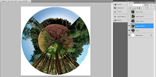
At the tutorial it was suggested that instead of printing my image on acrylic I should go for a really blown up version of the print. I put my image into an A1 sized document in photoshop and zoomed in to 100%. This allowed me to see little dots and hairs on the film I didn’t previously see because of the size. The top image is the edited image where I got rid of any odd marks, and the bottom is the original image. It’s quite hard to see the difference, but there are some obvious marks I removed. I slowly went through every section of the photo and made sure everything was gone.
Testing Brightness
I went to get my images printed professionally in order to
double check the brightness of the images. These are 5 tests and the original
image. They have all been brightened in different ways so I added the number of
the image to the top left corner so I could identify which one printed best.
I think 2 and 3 have the best outcome. They both look bright
enough without having blown out the detail in the sky or of the landscape.
Square vs Circle
After Daniel telling me several times that he prefers the square image, I decided to use my facebook page and see what other people had to say. I posted a post explaining a little bit about my work and asked if people could comment on which one they prefer. Lastly, I added my blog so people could have a look at what my project is about. First I posted it on my photography page, and then shared in on my facebook page. My brother and mum also shared it so I got a wide audience looking at the images in several different countries. A few people that I don’t even know commented on it too!
After the image being up for 24 hours, I took a snapshot of the results. Everyone wrote that they preferred the circular image to the square.
I prefer the circular image too, I think it’s a lot more interesting to look at and people want to know more about the subject matter. I wrote quite a while ago that I wanted to teach people about succession, and in order to do that I have to create something visually interesting – something that grabs their attention. Clearly, the circular image in much more popular, and I think if both of these images were in a gallery, people would be more inclined to read the accompanying text of the circular image rather than the square image.
Wednesday, November 14, 2012
Booked Flights
After both of our Visa's were granted, we really started to think about flights. Our first price quote was £712, but that was over a month ago. We searched a bit online and went back to STA to see what they had to offer. From last time we checked, the price had jumped up by £60, so we were advised to book the flights as soon as possible, before the flights get even more expensive.
We decided to book an appointment for the next day (today) and booked the flights! In the end it was £779 each, which isn't so bad for three flights. We'll leave from Heathrow at 20.40 on the 27th of August, and we will arrive on the 28th in Dubai at 6.30. We will spend 2 nights in Dubai and on the 30th we'll leave at 9.35 and arrive in Singapore at 20.55. We'll be there until the evening of the 3rd of September and we'll arrive in Melbourne at 7.40 on the 4th of September.
It's a lot of flying, but it'll be worth it. We'll be able to see all of these cool places and it means we don't have to be on a plane non-stop for 22 hours!
Sunday, November 11, 2012
Testing Brightness
Getting the brightness right of the photos has been a bit of a pain. The photos are coming out slightly dark when I print them myself, but nowhere near as dark as other companies have printed them. Because I want my final to be acrylic mounted I will need to get it printed somewhere.
The photo above shows how I’ve been slightly changing the brightness in every photo. You can’t really tell a massive difference because of the quality of the photo (taken on my iphone). The largest photo is the print by photobox, and the smallest one is by white wall, the acrylic print. The rest have been tests. Nothing has come out as dark as the print from photobox, which is a bit odd, and therefore it’s hard to change the brightness as I don’t understand why the print has come out so dark in the first place.
I started off by just brightening the whole image (top left image on the sheet of 4), but it completely got rid of the colour in the sky. After than I started brightening each photo individually. I lost quite a bit of colour in the heathland and so while brightening I also added colour so that none of that detail would be lost.
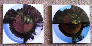
The print with two images on it, is (for now) my final. The image on the left is the original (as you can see it’s not as dark as the photobox print) and the image to the right is the newly edited version. There is still enough colour in the photo, and it has also been significantly brightened. I might get some 6x4 prints from photobox in order to test whether the brightness has worked, before I think about ordering my final print.
Saturday, November 10, 2012
Acrylic vs Aluminium
It took quite a while for the acrylic and aluminium prints to
arrive, but I’m happy that I tested it before spending lots of money on getting
a big print. The aluminium (left) is quite disappointing. It could be because the
image is meant to be a lot larger, but it seems the quality of the photograph is
horrible! The paper on which the photo is printed isn’t very nice either. The acrylic
on the other hand is fantastic. The photo looks amazing, and unlike the aluminium
print the quality is great too.
For my final I will definitely get the photo mounted on acrylic.
The photo, again, did turn out quite dark. On my screen the photo looks fine, but
everytime I get it printed it looks really dark so I’ll have to fix that before
I get the final printed.
Proposal for Self Led Brief
I had a tutorial yesterday regarding my self led brief project and the concept has slightly changed from last time:
The thing that stood out to me the most about my set
brief project was the scientific aspect of it. I mentioned in my workbook
various times that I really enjoyed Environmental Science at school and thus
combining photography with a scientific subject matter was a great way to get
me passionate about the work. In order to be equally passionate about this
project I want to have a similar scientific approach. However, instead of landscapes, I want to put a greater focus on the specific species of plants
that are in Horsell Common. The photos will become an annotated scientific
documentation of the plant species. I’m hoping to particularly look at rare
species, or unique plants, rather than documenting the obvious. I want the book
to be interesting and include unique photographs of the plants.
In my time lapse I will be idealising the area, but
again I want to maintain the scientific aspect to my project. It will almost be
like a documentary of Horsell Common, although there will be no narration. For
my previous time lapse I used quite straightforward landscape shots similar to
my final images, however for this project I want to focus both on the landscape
as well as more detailed shots of the plant life. The majority of time lapses I
have viewed make use of a camera slider, and therefore, instead of having still
scenes, I will use a camera slider to make the video more interesting.
Photography used to be seen as a technology, not as
art. There was an assumption that all images were accurate and dispassionate.
It was a way of keeping a record for anyone who needs “absolute material
accuracy for professional reasons” (Baudelaire 1859). Photography was only used
to document something in a factual manner, “she [photography] is the sworn witness
of everything presented to her view” (Eastlake 1857). Because photography was
seen to be so accurate, it was used for classifications. I am returning to the
factual documentation of photography and therefore will have to do a lot of
research into the origins of photography and the technological side of it,
rather than the artistic side. Liz Wells’s Photography:
A Critical Introduction is a great start. Wells writes about how people
started to differentiate between the technological and artistic side by purposely
taking shots that were “out of focus, slightly blurred and fuzzy” (Wells,
2004).
Monday, November 5, 2012
New Creatives
Oliver Merkin sent me a list of some of the dates he'd set up with the colleges on the opening day:
Unfortunately I won't be able to go to the introduction talk at Havant because I'm working from 3 until 6 on Monday. I will be able to attend both of the introduction talks at Portsmouth, so that will be very exciting. A lot of the dates haven't been confirmed yet, but I'm sure after the introduction talks everything will slowly start to sort itself out.
Havant College
· 12th November Monday 4-5pm - Introduction
talk by myself followed by Q&A and introduction of the theme (Oliver Visit
#2)
· 26th November Monday (time TBC) - Workshop 1
(Oliver Visit #2)
· 12th December Wednesday 12pm - Visit to Aspex
galley
· 14th January (time TBC) - Workshop 2
(Oliver Visit #3)#
· 4th February Monday (time TBC) - Oliver, Mimi and
Chris to select final 20 works for exhibition
· 25-28th February (Date TBC) - Delivery of
artworks to Aspex
· 4th-6th March (Date TBC) - Curation and
installation of works in the gallery
· 8th March 6-8pm - Preview Event.
Portsmouth College
· 15th November (Thursday) 10-11am, 11am-12pm - Introduction talks
(X2) by myself followed by Q&A and introduction of the theme (Oliver Visit
#1)
· 7th December (Monday) 9.30am-12.00pm - Workshop 1
(Oliver Visit #2)
· 12th December (Wednesday) (time TBC) - Visit to Aspex
galley with students
· 11th January (Friday) 9.30am-12.00pm - Workshop 2
(Oliver Visit #3)
· 8th February (Friday) (time TBC) - Oliver + Staff
meet to select final 20 works for exhibition.
· 25-28th February (Date TBC) - Delivery of
artworks to Aspex.
· 4th March (Time TBC) - Curation and
installation of works in the gallery
· 8th March 6-8pm - Preview Event.
Unfortunately I won't be able to go to the introduction talk at Havant because I'm working from 3 until 6 on Monday. I will be able to attend both of the introduction talks at Portsmouth, so that will be very exciting. A lot of the dates haven't been confirmed yet, but I'm sure after the introduction talks everything will slowly start to sort itself out.
Granted a Working Holiday Visa
Dear Desiree,
The Australian Working Holiday Visa for Desiree Elaine de Vries has been granted and recorded on the Australian government database.
I received an email from STA today telling me that my Working Holiday Visa application was granted! This basically means that I got my visa and I will be allowed to go to Australia for a year! I applied for it really early, just in case anything went wrong, and I didn't think it would be this quick.
The visa will be valid for a year today, so I will have to go to Australia before the 6th of November. The 12 months start once I have entered Australia. Our plans is to go around the 1st of September. With this visa I will be allowed to work for one employer for up to six months.
The next step is getting the flights. We've been looking at quite a few different flights, but like I mentioned earlier we'll be going to Dubai and Singapore along the way to break up the flight. At the moment we're looking at about £712 for a one way, but hopefully we'll be able to find something cheaper. As soon as we've found a deal we're happy with we'll book the flight!
We have also started looking into things like travel insurance, tours around Australia, places we want to visit as well as how expensive it is to rent in Melbourne, what types of jobs are out there etc. We have made a list of the things we definitely want to do in Australia:
1. Learn to surf
2. Go snorkelling in the Great Barrier Reef
3. Learn to Dive
4. See rock Uluru and Alice Springs
5. Walk the Harbour Bridge in Sydney
6. Go to Byron Bay
7. Kangaroo Island
8. Fraser Island
9. Whitsunday's Island
10. Great Ocean Drive
11. Brisbane
.....etc!
Brighton Photo Biennial
I went to the Brighton to get my National Insurance card, and decided to go to a couple of the exhibitions of the Brighton Photo Biennial. I started off in the bookshop “PS Brighton”, and got some information about the event and a map of where the exhibitions are. I decided to go to the University of Brighton, Jubilee Square, Lighthouse, and the station exhibition. All four of them were very different from one another.
The
first exhibition I visited was the one at the University. The work was by Jason
Larkin and Corinne Silva. A lot of the photographs included landscapes, so it
matched quite well with my project. The image above was the first photo of the
show and was a good introduction: the human and environmental impact of
urbanisation. The photo shows the urbanisation through the car park and the
advertisement board, however there is an untouched landscape on the billboard.
The photos were printed on a very large format, so you could
come right up to the photo and see all the detail. They were framed and looked
very professionally presented. At
the end of the exhibition there was also a 30 minute video showing an interview
conducted by artist Omer Fast with a former Predator drone aerial vehicle
operation.
The
rest of the exhibition looked great. It made use of the white wall style of
exhibiting, so that there were no distractions. The photos were hung
differently on each wall. The image to the left shows that the photos were
printed on different sized paper and were hung in a scattered pattern.
The
photos to the right show a more organised way of hanging the images. The photo right shows three images next to each other. They are all the same size, and
are hung in a very simplistic manner. The bottom right photo, again has a very
simplistic layout. I love the idea of how the images are presented, two squares
of the same size, however the left has four images and the right has one image.
I’d love to do something like that for my project. It looks quite creative and
could give extra context to the large square image.
This
is the second exhibition I went to. It was completely different than the one at
the university. Firstly, it was outside so the photos were protected in a
weatherproof frame. The images are also all the same size and same height. Both
the front of the columns and the back have images on it so in order to view the
whole exhibition you have to walk around the whole area.
This
exhibition is by Simon Dack, and he selected the most compelling images from
over 40 years of political protests and put them into one exhibition. The
photos were printed quite big, so you could see a lot of detail in the photos.
I really like the idea of having the exhibition outside (surrounded by popular
restaurants) because it will probably have a much larger audience looking at
the images: The people who specifically go to the exhibition, but also people
who are unaware of the project and go to have dinner at one of the surrounding
restaurants.
After
that I went to the Lightbox exhibition called “Geographies of Seeing” by Trevor
Paglen. Paglen is a social scientist, artist, writer, and provocateur. This
work explores and documents hidden worlds. The second part of the exhibition,
called “The Other Night Sky” uses data from an international network of amateur
satellite watchers to track and photograph classified spacecraft.
I
really liked the location of the exhibition. It was a proper white wall
exhibition. There were white lights pointing at the walls to see the photos in
the most optimal light. It was very simplistic. Each photo had accompanying
text and other information.
Finally, I went to the
exhibition at Brighton train station. The first photo to the left explains what
fotodocument is – it’s been partnered with Southern Railway to display the
exhibitions in stations across the Southern network.
The
exhibition that was on was called “Urban Farming in Havana” by Lulu Ash. The exhibition
documents Cuba and how it has lost its supply of oil, machinery and petrochemical
fertilisers due to the collapse of the Soviet Union in 1991. Therefore the agricultural
system became unsustainable. Lulu Ash documents Organoponicos – community growing
spaces covering 8% of land in the capital, which have transformed derelict urban
spaces into thriving organic farms. “Lulu’s photo essay combines urban landscapes,
intimate portraits of the farmers and the techniques they employ, as well as highlighting
the benefits to health, environment and community life in Havana.”
The
exhibition went on for ages! There is a walkway from the main part of the station
to another part, and all along the side there were images. They were hung very high,
and the accompanying text was hung at an eye height. It was a shame that the images
were so high, because you couldn’t look at one photo individually. However, the
images were meant to be seen as a sequence – like a photo essay. As you walk along
the photos you see more and more detail about the life in Havana and the farming.
There is a wide range of images, which makes the exhibition very
interesting.
Saturday, November 3, 2012
Big, Unexpected and Exciting News
My boyfriend and I have been thinking about our plans when we've finished our course for quite a long time. We both knew for a fact we wanted to go travelling but had no idea where or what to do and how long. Over the summer holiday we have both been doing a lot of research and came up with the idea of travelling to Australia. Our plan is to go to Australia for one year on a working holiday visa. This way we could travel the country and have jobs to make sure we don't run out of money.
Today we applied for our working holiday visa. We had to answer lots of questions and because we both have different nationalities, yet living in England, we did have a couple problems. We will be leaving for Australia at the end of August 2013 and we'll be there for at least a year. If we end up really liking it we'll apply for a second working holiday visa and hopefully one of us could get sponsored and will live there for a long period of time.
The flight to Australia is 22 hours, and since the longest time I've ever spent on an aeroplane is about 8 hours, we decided we didn't want to do the whole journey in one go. Therefore we are spending three nights in Dubai and three nights in Singapore along the way. This way we get to see a little bit of everything!
Canvas vs Lite Canvas
I printed a canvas with a woodland photo on it, and another
one as a Christmas present. The woodland photo is printed on canvas and the
other one of canvas lite. I wanted to compare the two canvases and see which
one I prefer and whether I want to use it for my final year presentation.
I much prefer the look of
the normal canvas (the thicker one). I think it’s because I prefer the photo. It
wraps around the frame beautifully. I decided to print this woodland photo because
the trees are dead straight. This works perfectly with how the photo wraps around
the sides. On either side of the canvas is a tree that fits entirely along the side.
The thickness is just right. If I printed the woodland photo on the lite canvas
the tree would have been half on the side and half on the front. The second photo
looks nice as well, but as a Christmas present, it’s probably better to save a bit
of money and print it on lite. For photography finals I would definitely print it
on normal thick canvas.
Subscribe to:
Posts (Atom)