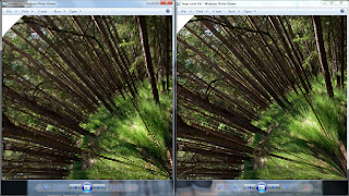
I had my second group tutorial yesterday and I showed everything the Doug Aitkens inspired photograph. Although some people liked it in this square format, other suggested that I should make it circular instead. I wasn't too sure about this concept at first because all the edges of the photos are completely different and wouldn't connect together, but I tried it anyway - if only to write in my workbook why it didn't work.
On the contrary, I love the result! Having it in a circular format emphasizes the cycle of it a lot more, and how it's continuous. You can turn the image any way you want and the sequence would still make sense. I used the same photos I used for the square format so I could easily compare them - but they are also my favourite photos.
Process:
1. Create the panorama
2. Open it up in photoshop
3. Change the canvas size so that the height and width is the same length
4. Rotate the image by 180 degrees
5. Move the image to the top of the canvas
6. Go to the menu bar and click on filter
7. Scroll down until you see distort and click on polar coordinates
8. A screen with some options will pop up, click ok
9. Wait!
 I made two of these panoramas, the first one was very small and was horrible quality (image comparison above). To make it better, I made the canvas size 750x750cm. In the end, the circular panorama was just a bit too big to fit on an A3 sheet of paper. I had a really good response from everyone on facebook, so hopefully the lecturers like it just as must!
No comments:
Post a Comment